
Suppose you are someone that does not have a lot of financial experience.
If you are trying to take your first steps into cryptocurrency it can be pretty tricky to understand how everything is in the world.
There is a ton of research and learn on this topic which can make the whole process seem quite overwhelming.
But, even in the face of adversity, there is light at the end of the tunnel! We are here to tell you that it is in fact not as difficult as you may have heard.
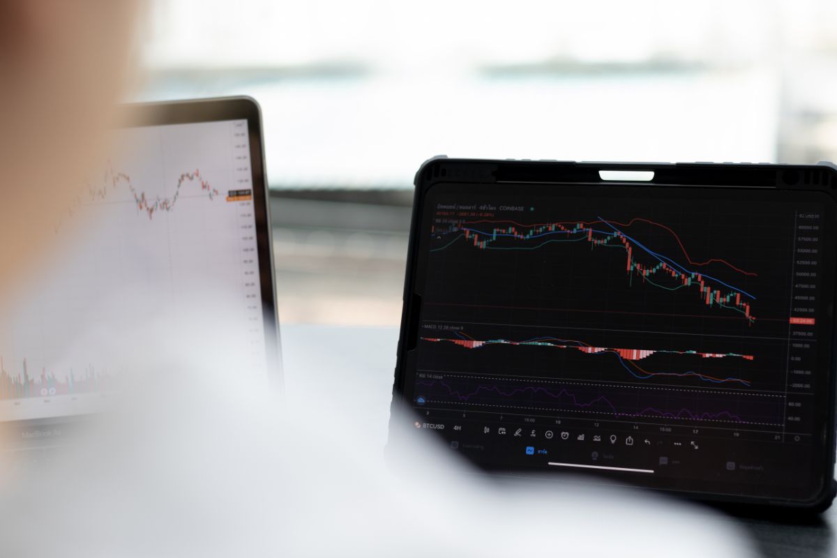
You are not alone in being overwhelmed by the charts on Binance. You can actually purchase bitcoin without understanding the charts.
But, of course, it is still better to actually have an idea of how everything works. So, in this article, we are going to go over how to read these Binance charts. Let’s get started!
Let’s Take A Look At Trading Charts
Before we get started, it is recommended that you sign up with Binance Exchange so that you can easily reference the charts we are talking about.
The charts you see on this website are actually quite simple if you know what you are looking at.
If you start understanding the charts you will be able to see their offers which mostly talk about larger amounts of coins in order to trade versus places such as Coinbase or the Voyager Apps.
The aforementioned two apps are considered the best mobile exchange solutions.
Binance is a great website that you can use every single day, because of this it is one of the most recommended exchanges.
When you are logged in to your Binance, you should go to the exchange tab where you can get an overview of information about the markets.
If you click on the ‘Exchange’ tab you will see two options pop up, Basic and Advanced.
While you might be tempted to click on the basic option, this is actually more difficult to understand than the advanced tab.
If you don’t believe us, take a look yourself. The basic chart is far more awkward to understand than the advanced chart.
But before we get into the advanced chart, let us take a closer look at the Candlestick Chart which is the trader’s choice.
Let’s Talk About The Candlestick Chart
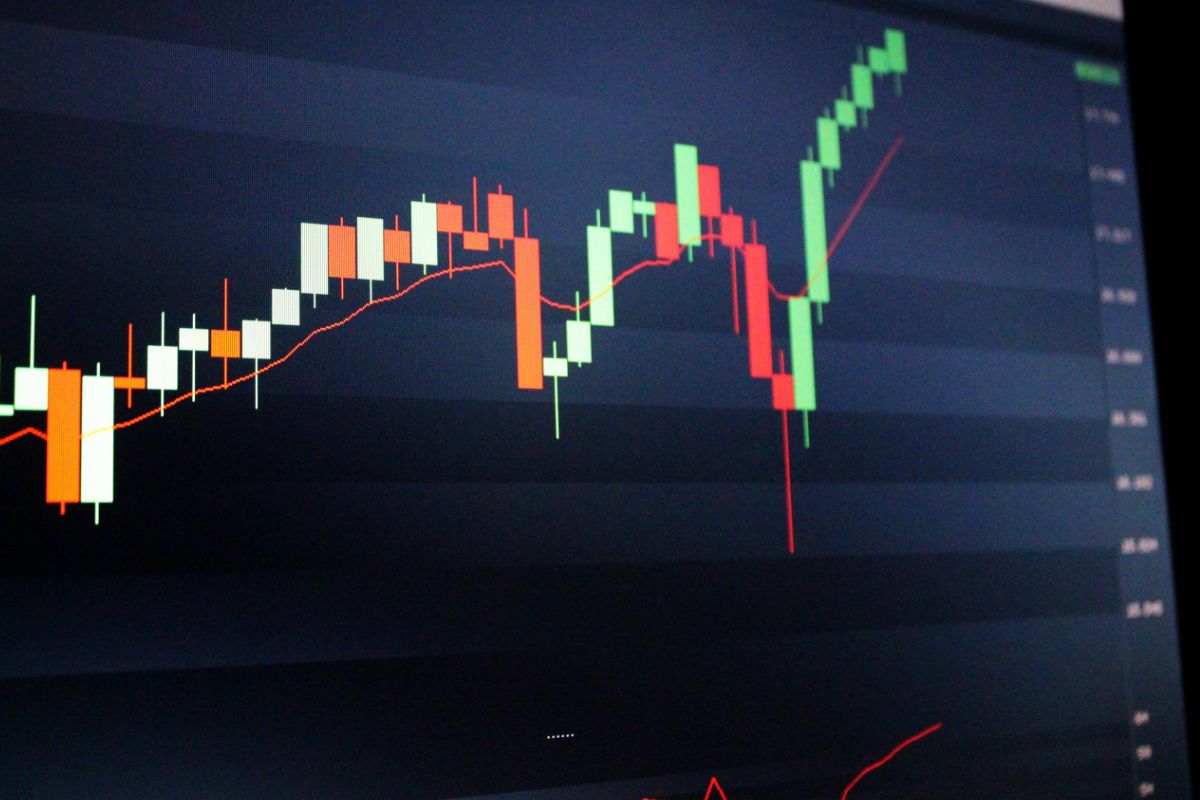
There are a wide variety of crypto charts out there, but none come close to the Candlestick Chart which is the one that most traders choose.
If you take a look at a candlestick chart you will notice that it is made up of green and red for the majority.
These red and green bars are known as ‘candlesticks’ and each one is indicative of an open or a closed price. They also represent the high and low points.
The colored part of the chart is known as the body, this part of the chart will show you how much of something was traded and the red and green bars represent if the price has opened or closed.
The lines at the ends of the bars, also called a wick, will be indicative of the lowest and highest prices within a specified time period.
The color of the bar will show you whether the closing price was higher or lower than the opening price.
The green bar is indicative of the closing price being higher than the opening price while the red bar is indicative of the closing price being higher than the opening price.
The green indicates an uptrend which is often called ‘bullish’ while the red bar indicates a downtrend and this is often called ‘bearish’.
The reason that this chart is used by traders the most is because it is a useful tool in technical analysis which helps to predict whether the prices will go up or down.
Candlestick is pretty simple to understand.
Now that you have half a clue how this type of chart works we can take a closer look at the interface which has a bunch of important parts to it.
Crypto Chart Interface On Binance
The general interface is one of the things that confuses people the most when they are just starting out with learning about Binance or Crypto.
In the center of your screen, you should have the candlestick chart. When you move your cursor around the screen you will be able to see the data available for that position in time.
At the top of your screen, you should be able to see the last price and any changes within a twenty-four-hour period.
At the bottom left of the chart, you should have a large space where you can open orders.
This space allows you to have an area where you can see any orders that have been placed and when it has been filled.
Below are a few things that you need to know about crypto chart interfaces on Binance:
- Time Signature – If you change this you will be able to change how much time each of your candlesticks represents.
- Trading Pair Tab – If for example, you want to use Bitcoin to purchase Ethereum you can search for ETH to find the trading pair. You can change your trading pair as you see fit.
- Order Book – This is essentially a list of all of the currency buy and sell orders that have not yet been filled.
- Volume Bars – At the bottom of your chart there will be volume bars that will link with the time-Signatures that have been selected.
Final Thoughts
We hope that you have enjoyed learning about how to read Binance charts.
It can be complicated and there is more to cover that we have not been able to talk about in this article.
But, rest assured that it is simple enough to learn and once you have a basic understanding of Binance charts, the likes of which we have provided, you should be well on your way to understanding how to read Binance charts.
We hope that you have a fantastic day and we hope to see you again!
- Is It Too Late To Invest In Bitcoin? - June 17, 2022
- How To Calculate Bitcoin Profits - June 17, 2022
- How To Buy Crypto On Venmo - June 17, 2022


